A little backstory
I little while ago I was asked by a client to set up a website using a parallax WordPress theme. They had already started using the OneEngine theme but there were still many things that needed to be sorted out. Proper documentation for the theme is severely lacking so you have to feel your way around it. Despite it being a really nice responsive theme, one of its biggest issues in terms of branding is that the logo you place in your header does not scale.

“Yeah, this looks pretty good.”

“Uh oh. We’re running into some overlapping trouble here.”

“Oh God, NO! WHYYYYY?!?!”
I looked around forums for a solution to this but it seems nobody had addressed it yet so I gave it a shot. With just a few modifications to a couple of source files and a bit of custom CSS, I had an adaptive logo that wouldn’t bleed past the header or be obscured by the menu items.
Step 1: Different logos for different screens
I didn’t want to simply scale down the logo I had. In my case, I wanted to feature a full logo showing the brand name with a tagline on the header menu when seen on a computer, and only feature the brand’s name when viewed on a mobile device. This meant that I needed to set two images for the logo in the Theme Options.
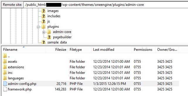
In order to create an additional logo option in the Theme Options -> General settings you have to edit the admin-config.php file. This is found under /wp-content/themes/oneengine/plugins/admin-core/admin-config.php.
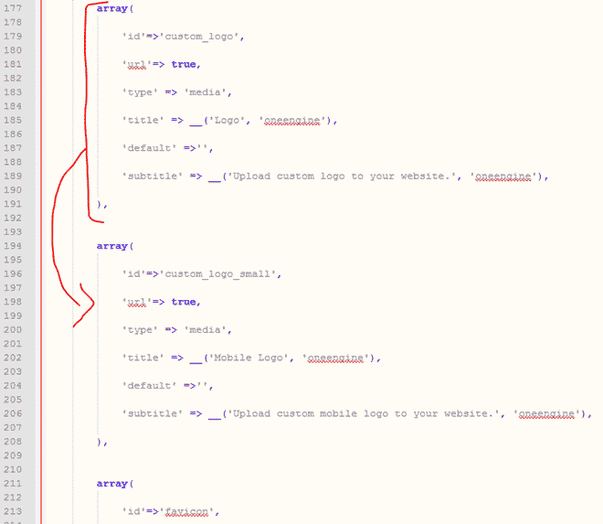
Go to line 177 (or find the string “custom_logo”) and make a copy of that array just under it. Change the id, title, and subtitle to something like the image below. Save the file and replace it back on your WordPress server.
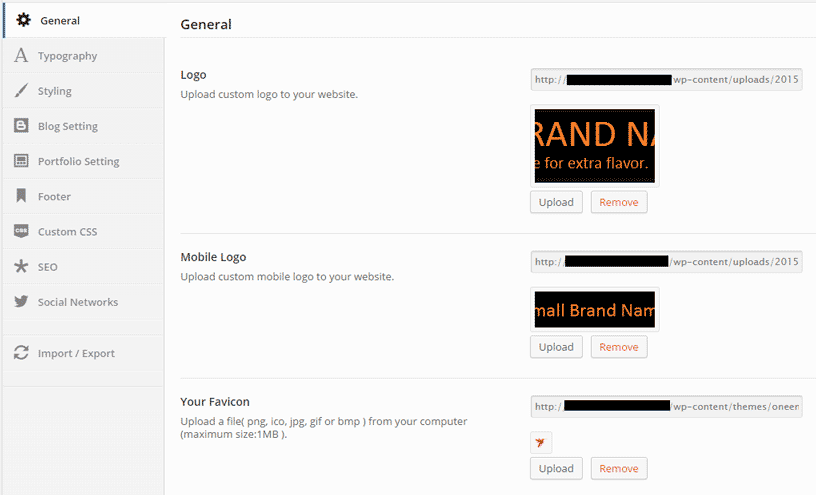
Once you go back to Theme Options -> General in your WordPress, you’ll find another section where you can upload a logo for mobile devices.
Step 2: How to switch the images
To let the browser know when to use each image, we’ll need to create an additional image element referencing the new mobile logo. Normally, this would require some nifty CSS trickery but since OneEngine already uses the Twitter Bootstrap we can just assign some simple classes to each image element.
In your WordPress admin console go to Appearance -> Editor and select the header.php file. Look for the block that has the following line of code:
echo '<div class="logo-wrapper" style="'.$width.$left.$top.'"><img src="'. oneengine_option('custom_logo', false, 'url') .'" alt="'.get_bloginfo( 'name' ).'" /></div>';
Replace it with the following lines:
echo '<div class="logo-wrapper hidden-sm hidden-xs" style="'.$width.$left.$top.'"><img src="'. oneengine_option('custom_logo', false, 'url') .'" alt="'.get_bloginfo( 'name' ).'" /></div>';
echo '<div class="logo-wrapper visible-sm visible-xs" style="top: 15px;"><img src="'. oneengine_option('custom_logo_small', false, 'url') .'" alt="'.get_bloginfo( 'name' ).'" /></div>';
What we’re doing here is assigning the first logo container (the big one) the hidden-sm and hidden-xs classes. This tells the browser to hide that block when the width of the browser is under 992 pixels. At the same time we create a secondary logo container that shows the custom_logo_small option that we added to the Theme Options. This container is configured to appear only when the browser width drops below 992 pixels by using the visible-sm and visible-xs classes.
Step 3: Go take a look at your adaptive header logo!
That’s it. You can now go see your adaptive header in action.

“This is looking MUCH better.”

“SUCCESS!”
Using the same methods listed above you can set additional logo containers for other sizes in case you need to define more specific resolutions.
If you have any questions about the fix applied here please let me know in the comments and I’ll get back to you.

I’d like to add in a tablet sized logo as well but can’t quite figure out what to add in the header.php file to accomodate the new custom logo. Any advice?
Hi Kendal,
If you want to add another logo size then you’d first need to add another block in Step 1 and call it Tablet Logo. When you check the Theme Options you should see two additional logo fields (Mobile logo and Tablet logo). Once you do this you’ll want to add another div container to your logo area. I updated the code portion of the article to show the differences in code a bit better. It should be easier to see that there are two div containers for the logo.
For displaying and hiding the container I used the
hidden-smandhidden-xsclasses but to make things easier you can use thehidden-phone,hidden-tablet, andhidden-desktopclasses. Your three header.php container should look something like this:echo ‘<div class=”logo-wrapper hidden-tablet hidden-phone” style=”‘.$width.$left.$top.'”><img src=”‘. oneengine_option(‘custom_logo’, false, ‘url’) .'” alt=”‘.get_bloginfo( ‘name’ ).'” /></div>’;
echo ‘<div class=”logo-wrapper hidden-desktop hidden-phone” style=”top: 15px;”><img src=”‘. oneengine_option(‘custom_logo_tablet’, false, ‘url’) .'” alt=”‘.get_bloginfo( ‘name’ ).'” /></div>’;
echo ‘<div class=”logo-wrapper hidden-desktop hidden-tablet” style=”top: 15px;”><img src=”‘. oneengine_option(‘custom_logo_small’, false, ‘url’) .'” alt=”‘.get_bloginfo( ‘name’ ).'” /></div>’;
I hope that helps!
Hello,
I can copy and paste the array. The same field will show up twice. However when I start editing it to become the mobile image uploading field as shown in your example, I get an error and can’t see my admin page any more. Would you be so kind as to shine your light on this?
Thanks!
Hi Jorn,
You have to be really careful when updating admin files for your WordPress themes or plugins since they can cause your page to stop responding. The most likely problem here is a syntax issue with the code that you copied. Maybe it’s missing an apostrophe, a comma, or a semicolon. Send me a copy of the php file you modified to luis[at]luisten.com so I can take a look at it.
Cheers!
Thank you for your post ! Helped
Maybe there is any easy way to disable mobile version of the page (instead show full version). Maybe delete some parts of css ?
You would have to eliminate quite a lot of stuff in the CSS files on order to get rid of the mobile version but I’m not sure you’d really want to do that considering mobile is such an important part of having any website. On top of that, not having your site mobile ready hurts your SEO rankings.
Hi there, nice tut you have. I know this is out of topic, but, could you tell me how to modify the thickness of the header? I tried to search it in header.php and index.php but still nothing happens. Thanks a bunch.
Hi Faufau. In order to modify the header thickness of the navigation header you can insert some custom CSS. Just insert the following: #site-navigation {height: 100px;}
You’re usually going to want to make visual changes like that through CSS and not directly in your PHP files.
I hope that helps!
Thanks for the great little tutorial. I’ve discovered this channel on YouTube: https://www.youtube.com/playlist?list=PLaQwOdT8Vlw9WoY4W_wrK-QsyMW3V3e5J
The guy does a brilliant job of explaining the ins and outs of OneEngine.
Cheers
Rob
I agree. His stuff is great.
Thanks man for the help, I have been trying to sort this out for a week now
My pleasure. I’m glad the solution worked for you.
Thank you for your post , I found it very helpful.
I would like know if it’s possible to do this from a child theme to avoid losing the code when update the theme
Thanks!
Of course, Juan. Ideally, you would implement this solution in your child theme to avoid conflicts when it comes to future updates.
Thank you Luis very much. Worked like a charm.
Awesome, I’m glad it helped!
Hi Luis,
great Tut but i’m having a problem i can’t find the file that will be edited do you know where can i find and edit it?
Thank you
Ahmed Bazina
Hi Ahmed,
If you don’t want to use FileZilla to access your site’s directory through FTP, you can edit the files directly from the WordPress console by going to Plugins -> Editor, and then selecting the plugin you want to edit from the dropdown list. I don’t recommend this option very much because it’s more difficult to read the code and find the files but if you don’t have the right tools at your disposal, it’s a quick way to getting the job done. In Step 1 of the article you can see the full path to where the file is located.
Good luck!
Hi Luis,
i have found it and did everything but just facing a small problem the logo is appearing twice on the desktop but on the phone there is only one also the logo is a bit down not really in the header here is the site if you can have a quick look at and advise me what to do i will appreciate it.
http://ahmedbazina.365onfire.com/
Thank you
Hi Ahmed.
I suggest that you go through your code again. It seems like you copied the line that echoes the “hidden-sm” logo twice which is why it is appearing two times in the desktop version.
The reason that the mobile logo is hanging past the border is because the image is larger than what I used in the example. You’ll notice that in Step 2, the second logo has a style option with “top: 15px”. You need to modify this value accordingly in order to position your logo correctly.
Try changing the style values until you get the results that you’re looking for.
I hope that helps. I think you’re getting the hang of it.
Cheers!
Hi Luis! I’m trying to hide the original logo when the width of the browser is under 1200px, istead of 992px as you explained. Could you tell me how I can do so?
Thx!
Hi Benjamin,
In Step 2 you’ll notice that the classes for the original logo include hidden-sm and hidden-xs. Add the class hidden-md to these. Likewise, for the smaller logo you would have to add visible-md. This should put you within the 1200px boundary that you’re looking for. These classes are part of the Twitter Bootstrap. You can find more information about it here: http://getbootstrap.com/css/
Good luck!
Hi Luis,
Thanks for this.
I was wondering though, how do I find the /plugins/admin-core/admin-config.php file in my child theme? As it’s not been transferred over and still takes from the parent theme… which I understand will cause an issue if it’s ever updated.
Hi Ollie! You would first have to copy the files from the parent theme to your child theme’s folder and then update the functions.php file of your child theme so that it reads the right version of the file. There’s a bit more to it than I can explain in a comment but take a look at the WordPress Codex for child themes for more documentation.
If you don’t feel like messing around with child themes and coding all of that, you can download that file, update your parent theme, and then re-upload the modified file back. Of course, you’d have to make sure to do it this way on every update.
You can always reach out to me through the Contact page and I take care of the whole thing for you as well.
Hi Luis,
Thanks for the blog mate, very helpful. The header.php looks a little different now, could you please help with the updated code for it?
Step 1 works a treat still, but I get a bit stuck at this point.
Thanks so much, this is extremely helpful
<a href="”>
<?php
$top = '' ;
$left = '' ;
$width = '' ;
if( oneengine_option('logo_top') != '' )$top = 'top:'.oneengine_option('logo_top').'px;' ;
if( oneengine_option('logo_left') != '' )$left = 'left:'.oneengine_option('logo_left').'px;';
if( oneengine_option('logo_width') != '' )$width = 'width:'.oneengine_option('logo_width').'px;';
if( oneengine_option('custom_logo', false, 'url') !== '' ){
echo '’;
}else{
?>
E
Hello Luis,
Thanks for your post! Exactly what I’m looking for. But when I copy – paste the array and follow all your steps I still don’t get the option to upload a logo for mobile logo in Theme Options -> General.
Is this possible with the latest version of OneEngine?
Thanks for your help!
BR,
Emil
But when I go to the site on a mobile device the logo is just text… weird.. Plz help 🙂